Posts Tagged Branding
Cards in Hand
Posted by Adam A. Ries in About Me, Graphic on March 28, 2011
My first official business cards are in. It has only been a few days since I wrote about designing them and placing the order (which you can read here), so by now you know 1 of 2 things: Either my mail carrier rides a jet pack or I blog about things about a week after they actually happen. Shipping for these took just about two weeks exactly from the date I placed the order online through Vistaprint. But now onto the cards.
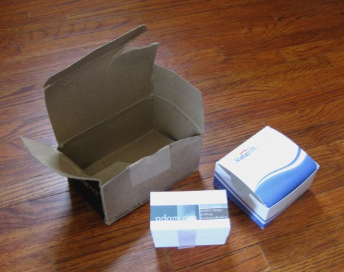
As I mentioned before, I uploaded my own images to the Vistaprint website as high quality JPG files (600 DPI to be exact). The website interface was easy to use and they offer a PDF proof of how your order will look before you make your purchase. The cards arrived in a medium cardboard box with a much smaller box inside containing the cards. While the outer cardboard box was surprisingly mauled (must be from the USPS jet packs?), the smaller box inside as well as the actual cards themselves arrived unharmed.
The spacing of the graphics on each side is perfect and the print quality is great! My only minor complaint is that the text on the back of the cards is not a true black; it is more like dark brown. The colors in general are just a bit yellowed to me, but that’s getting nit picky. I’m wondering if that is because I uploaded a JPG file rather than the original Photoshop PSD file. But it doesn’t matter all that much. Overall, I am really pleased with the quality and the look of the cards. With their affordable prices, I will definitely use this printing website in the future.
Down to Business, Cards
Posted by Adam A. Ries in About Me, Graphic on March 24, 2011
My favorite category on Wheel of Fortune is Same Name. Can you tell? Down to Business. Business Cards… Nevermind.
If you didn’t get the Wheel reference, at least you will know from the title that I have designed myself some business cards. I’m not sure where this freelance thing might lead, but I am definitely not going to pass up any opportunities either. Because I’ve had several people ask for my contact info, I spent a few days working in my spare time on a simple business card design. This is probably the first step in branding myself and I am pleased with the outcome. I’m not saying this will be a permanent brand image or anything, but it works for now. The colors are masculine and I feel the simple cube and lines image can be used in so many ways.
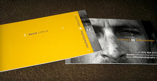
Here are some great business cards I came across for inspiration. Each one makes simple use of color and blocks of text. Although simple, each is unique and defines a brand. The third, being that of a photographer, uses a great black and white photograph with the bold yellow.
I didn’t want anything as bold as the yellow card, but just text on a white background was too simple. I used a great color book to find colors I felt expressed myself, my brand and the work I can do. Titled Color Index, by Jim Krause, it was a gift from a close friend during my early years of college and I use it all the time for graphic and web colors.
The square shape was a result of sketching in my spare time. I originally liked the idea of two lines at a right angle, creating 3 different line lengths. Then I realized I could create the illusion of lines with three blocks of color, getting both the lines and colors in one simple shape. Although I plan to use the block in proportion most of the time, it makes a great stripe on the front of my card by extending it horizontally.
That being said, here is the final card design. The outline isn’t on the actual cards, I added it so you can see the card better on a white background.
I didn’t order a huge quantity, only 250 from Vistaprint. Their online design interface is pretty easy. I just uploaded high quality JPG files the exact size of the card front and back. They should be in sometime this week. When they arrive, you can be sure I will post an update about what I think of their print and card stock quality.


